
Concept brand · Wett
How we would build a lube brand.
Wett is a concept brand we created to show how RedPxl would take a product from zero to launch: the name, identity, bottle, packaging, campaign and storefront for an all-natural lubricant made for adults.
- Brand
- Wett
- Project
- RedPxl concept brand
- Sector
- Sexual wellness ecommerce
- Services
- Creative Studio, Web Development, Retention, Paid Media
The concept
A lube worth leaving out
Wett isn’t a client. It’s a brand we invented to show how we’d take on an overlooked category: design a lube people would be proud to leave on show, then plan exactly how we would launch it.
What we wanted to show
How we would turn a product people hide into one adults want on display.
How we would position a natural lube brand at a markup price compared to competitors.
How we would plan a launch that gets talked about, from guerrilla stunts to paid media.
Chapter 01 · Creating the brand
Creating a concept that feels natural
Competitor sites and ads looked childish, and the market leader had grown comfortable. We’d build Wett around water, plants and frosted glass: fresh, adult and good for you. Aesop did it for hand soap. We’d do it for lube.


Brand Identity
The name and logo
Wett is provocative on its own without spelling anything out. The logo started as a hand sketch finished in Illustrator: its curves echo the moments it’s made for, and the lettering takes the shape of plant leaves to signal a natural formula. Mature, but leaning towards fun, because using it should be.

Product Design
The bottle and scents
The bottle borrows from fragrance and skincare. In production it would be plastic finished to look like frosted glass: high perceived value, and realistic to ship. We’d keep the range to cucumber, lemon and forest berries so nothing feels overwhelming.
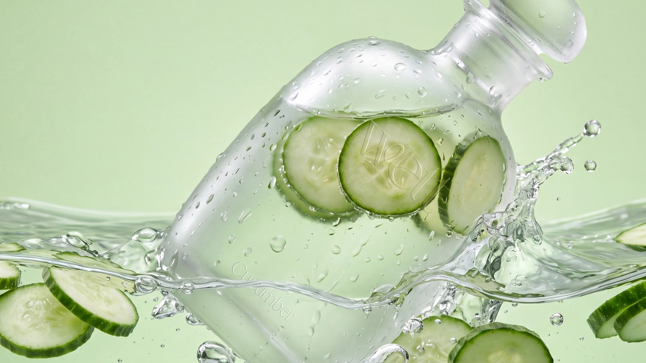
Scent 01
Cucumber
Cool, clean and green. The freshest of the three, built around the cucumber slices you see through the frosted bottle.
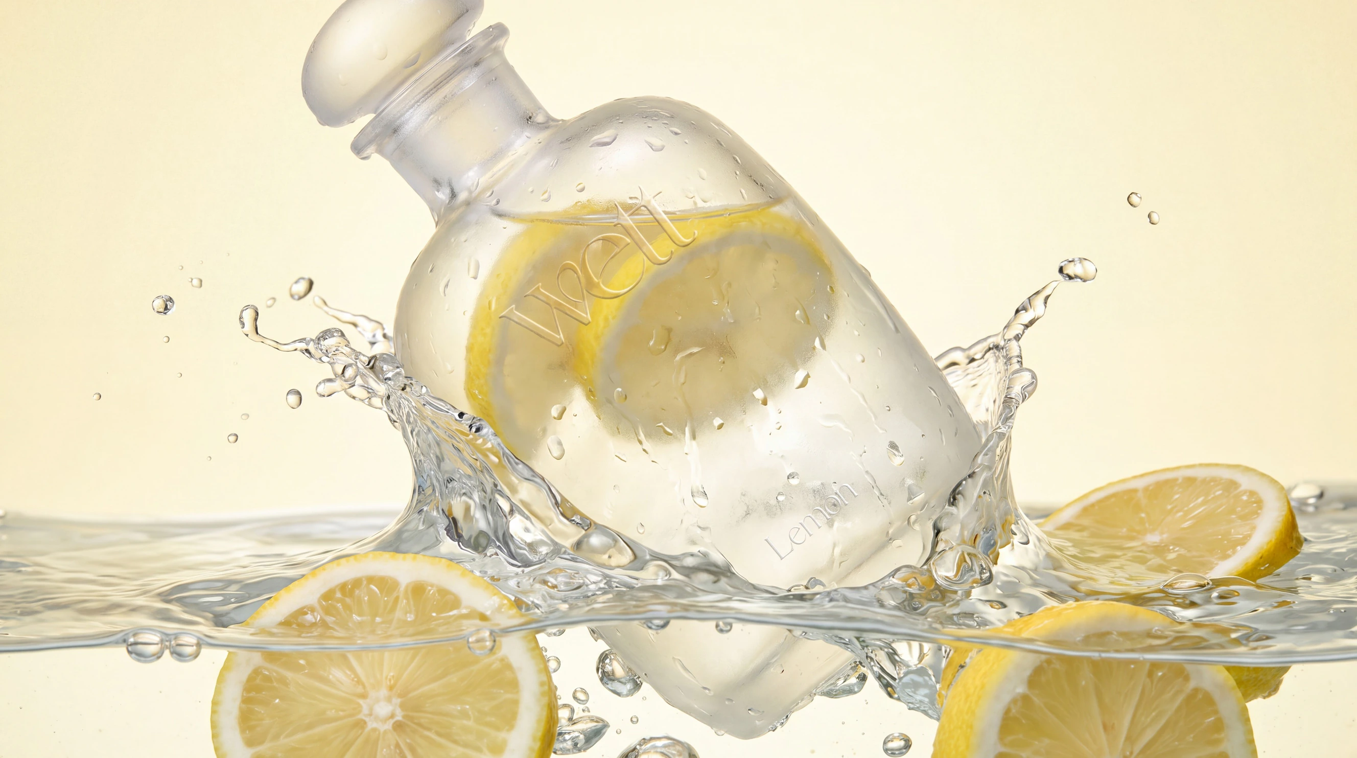
Scent 02
Lemon
Bright and zesty. A citrus scent that keeps the range feeling light, fresh and natural.
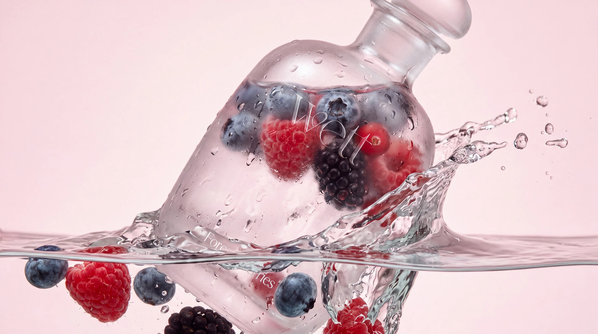
Scent 03
Forest berries
Deep and a little sweeter. The richest of the three, for when you want something warmer.


Packaging
Packaging and the reveal
White on white, with a wave texture that hints at water and an unboxing inspired by Apple. A refill pouch would keep subscribers topped up.

Packaging retention: a card printed in hydrophobic ink would hide a discount code that only appears once it gets wet. A small reveal people would film, share and come back for.


Chapter 02 · Turning ideas into reality
How we’d bring it into reality
The launch would start in the real world: free guerrilla marketing, a launch event people talk about and brand activations. Paid social would then scale it online once we know which message wins, with collaborations to follow once the brand is established.
Guerrilla marketing
Hydrophobic spray would turn streets and cars into ads. Sprayed surfaces stay dry in the rain, so the Wett logo would appear as everything around it gets wet.


Launch Event
A pool party without the water
We’d invite influencers and friends of the brand to a pool party with an empty pool and ‘Everything is better wet’ across the bottom. Twenty minutes in, Wett-branded tankers would roll up and fill it.


Brand Activations
Where Wett would show up
Four places Wett would show up in person, each one somewhere people are already getting wet. Concept ideas, not confirmed partnerships.
London Marathon
Branded water stations halfway round the course. Runners would grab a Wett cup to drink or pour over themselves, with a photographer capturing it for top-of-funnel ads.


Coachella
A Wett dunk tank and cool-down mist station for festival-goers trying to beat the heat, recut into organic and paid social content.


Skims drop
A limited Wett x Skims drop of wet-look pieces, launched to swap audiences between both brands.


Mama Shelter
A hotel takeover in London: Wett for sale in the rooms, Wett ‘Do not disturb’ signs on the doors and ‘Caution: slippery when wett’ signs in the corridors.


Paid Media
Four angles to test
Paid social would test four angles: natural and health, get wet, minimal, and a competitor call-out. The winning angle would get its own funnel and more creative behind it.


Chapter 03 · Web Development
The store we’d build
The site would carry the same clean look as the bottle and box: simple, easy to navigate, and a rainforest hero that ties back to the slogan, Everything is better wet.


The Result
Lube has the shelf space. It needs a reason to be seen. RedPxl would build it.
A name, an identity, a bottle, packaging, a launch campaign and a storefront, all carried by one idea: Wett is something you’d be happy to leave out. Wett is a RedPxl concept, not a client project.
Contact us
Tell us what you’re growing
- zain@redpxl.uk
- Phone
- +44 7525 832432
- Office
- Canary Wharf, London
- Hours
- Mon to Sun, 09:00 to 18:00
Send the numbers you have and the target you are working to. We will tell you plainly whether we can help.